The Psychology Behind Dark Mode UI: Why It's Not Just Aesthetics
Remember when dark mode was just for hackers and tech nerds? Those days are long gone. Today, every app from Twitter to Gmail offers a dark theme. But here's the thing-it's not just because it looks cool. There's actual neuroscience behind why dark mode feels so much better for many of us. And as designers and developers, understanding this psychology can make our interfaces not just prettier, but genuinely better for our users.
The Melatonin Connection: Why Your Eyes (and Brain) Prefer Darkness
Our brains are wired by millions of years of evolution. When it gets dark, our bodies naturally produce melatonin-the chemical that tells us it's time to sleep. This is why staring at a bright white screen at 11 PM feels like torture. A dark interface, on the other hand, tricks your brain into a more relaxed state. Your pupils don't have to contract as much, there's less glare, and your eyes genuinely feel less fatigued. It's not placebo; it's biology.
Studies from organizations like the American Academy of Ophthalmology have found that prolonged exposure to bright screens increases digital eye strain. Dark mode reduces this strain by up to 30% for some users. That's not negligible-that's real relief for people who spend 8-10 hours a day in front of screens.
Cognitive Load and Decision Fatigue
But it goes deeper than just eye strain. Bright interfaces actually increase cognitive load. Think about it-when you look at a white screen, your eyes are trying to process tons of information at once. Every element is competing for attention. Dark backgrounds, on the other hand, naturally reduce visual noise. They create a sense of focus and calm. Your brain doesn't have to work as hard to parse what's important.
This is why dark mode feels so good when you're tired or stressed. It's not laziness; it's your brain saying 'thank you' for reducing the workload. Every minute spent in a dark interface is a minute your brain isn't burning extra energy on visual processing.
The Battery Life Bonus (Mobile Users Are Real Humans Too)
Here's something we often forget: pixels emit light. On OLED screens (which most modern phones use), displaying black pixels uses significantly less power than displaying white pixels. Dark mode can extend battery life by 15-60% depending on usage patterns. Now, this might seem like a technical detail, but it matters emotionally to users. When someone's battery lasts longer, they feel less anxiety about their device dying. They feel more in control. It's psychology meets engineering.
The Brand Psychology: What Does Dark Mode Say About Your Product?
Here's where it gets interesting from a branding perspective. Dark mode carries psychological weight. It signals sophistication, modernity, and premium quality. It's no accident that high-end products like Apple, Figma, and Arc Browser offer stunning dark modes. The darkness doesn't just feel better; it makes people perceive your product as more advanced.
There's also an exclusivity factor. When a feature is optional and premium-feeling, users value it more. They feel like they're part of a 'cool' community. It's the same psychology that makes limited editions sell out in minutes.
The Accessibility Angle Nobody Mentions
For users with light sensitivity or certain types of vision impairment, dark mode isn't a luxury-it's essential. Some people with astigmatism find dark mode significantly easier to read. People with dyslexia often report better text comprehension in dark interfaces. And for anyone who experiences photophobia, dark mode can be the difference between being able to use your app and not being able to use it at all. This isn't just about comfort; it's about inclusion.
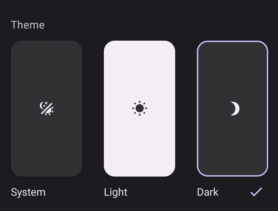
How to Implement Dark Mode Properly (Psychology + Best Practices)
Now that we understand the psychology, let's talk implementation. Because dark mode done wrong can be worse than no dark mode at all.
- Don't use pure black (#000000) - Use dark grays like #1a1a1a or #0f0f0f. Pure black can be harsh and cause unnecessary eye strain
- Maintain contrast ratio of at least 7:1 - Psychological comfort requires readability. WCAG AAA standards exist for a reason
- Use color strategically - Bright accents against dark backgrounds create visual hierarchy without overwhelming users
- Respect system preferences - Use prefers-color-scheme to detect user system settings. It's about respecting their intention
- Don't force transitions - Allow users to toggle instantly. Animated transitions feel manipulative when you're trying to adjust
css/* Smart dark mode implementation */
@media (prefers-color-scheme: dark) {
  :root {
    --bg-primary: #0f0f0f;
    --bg-secondary: #1a1a1a;
    --text-primary: #f5f5f5;
    --text-secondary: #b0b0b0;
    --accent: #5b8def;
  }
}

@media (prefers-color-scheme: light) {
  :root {
    --bg-primary: #ffffff;
    --bg-secondary: #f8f8f8;
    --text-primary: #1a1a1a;
    --text-secondary: #666666;
    --accent: #0052cc;
  }
}

body {
  background-color: var(--bg-primary);
  color: var(--text-primary);
  transition: none; /* Instant, no animation */
}
The Bottom Line
Dark mode isn't just a trend. It's a response to real human psychology-to how our eyes work, how our brains process information, and what makes us feel comfortable and in control. When you implement dark mode thoughtfully, you're not just following a trend. You're acknowledging that your users are humans with biological needs. That's good design. That's good business. And most importantly, that's good UX.